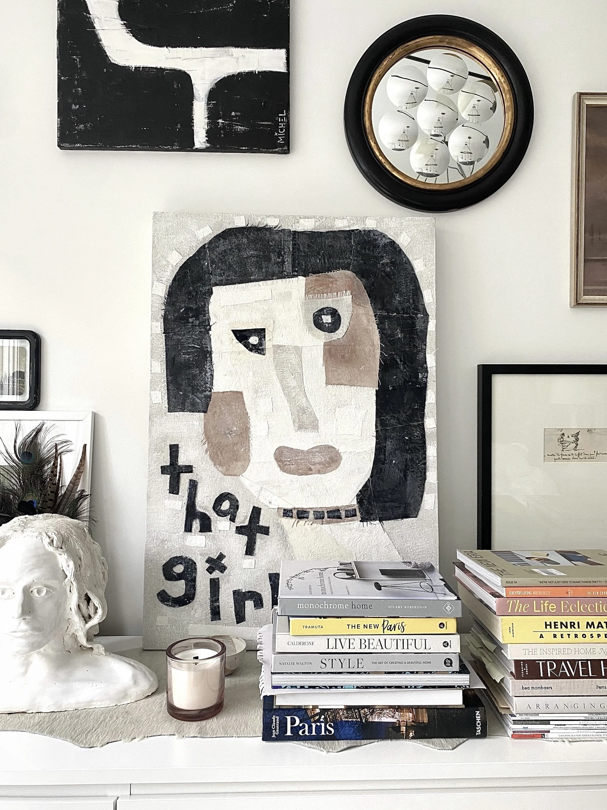
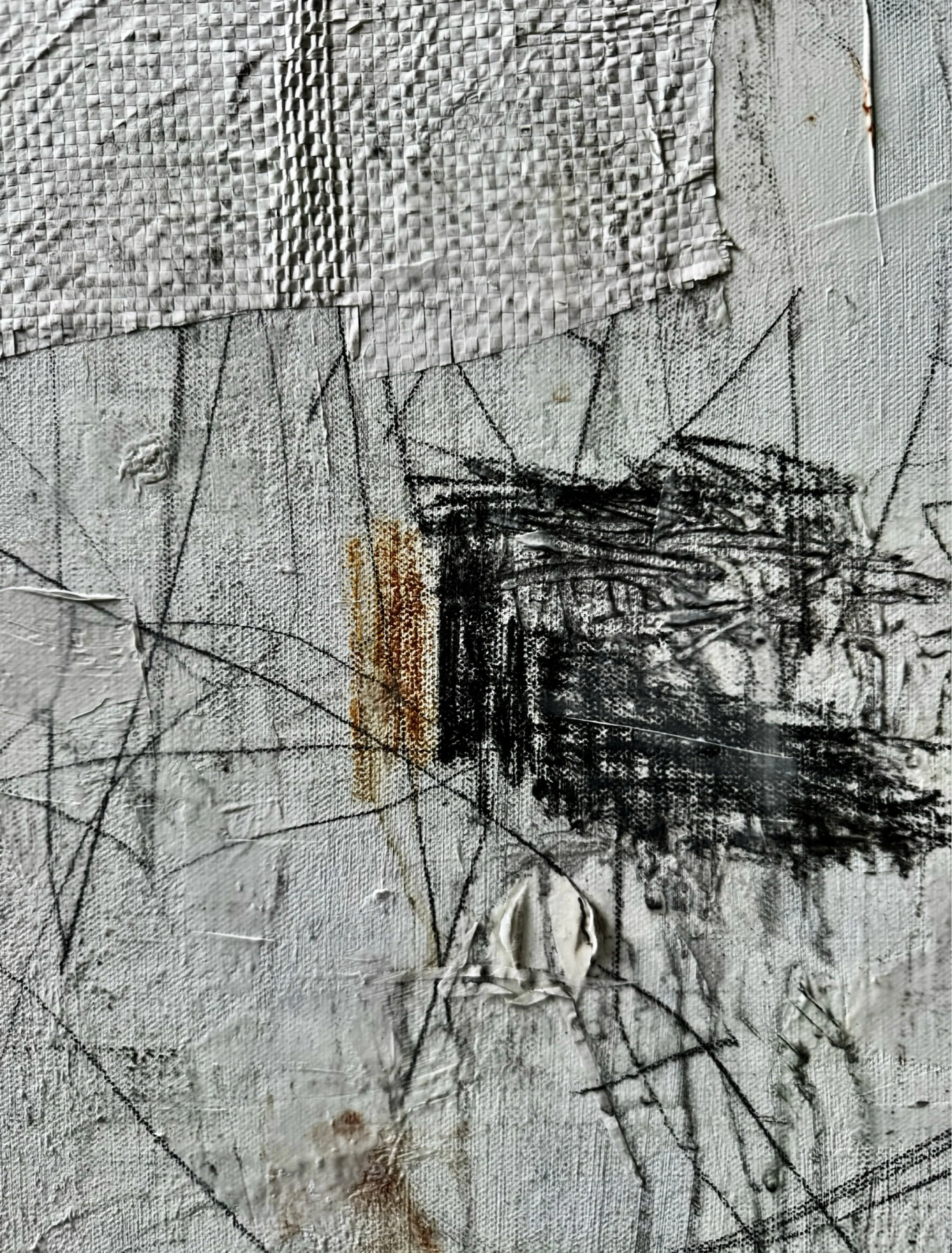
A BLACK + WHITE LOVE AFFAIR.
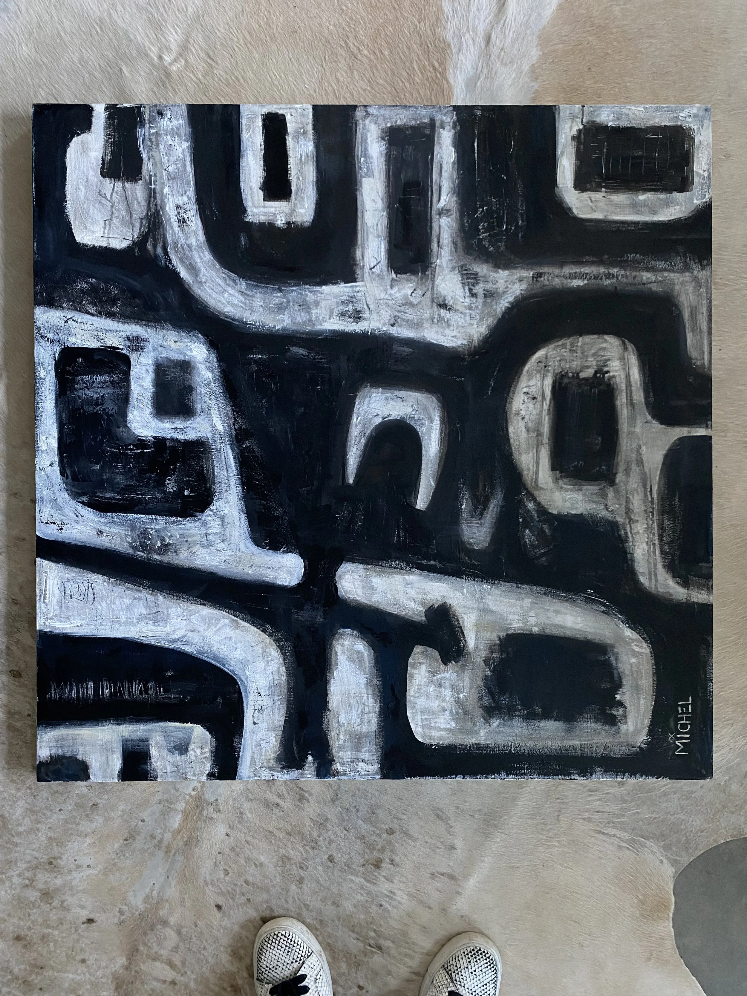
For much of my adult life, I’ve been drawn to black and white. Not just in my art, but also in my interiors, my wardrobe and the photographs I take. I don’t live in it exclusively, but I return to it often. It’s simple, striking and always feels intentional. It’s clean, classic, polished. Like it knows exactly what it’s doing.
There’s something about that contrast, light and shadow, softness and edge, that speaks to me. It shows up again and again in my creative process, not because I’m trying to make a statement, but because it feels aligned with who I am right now.
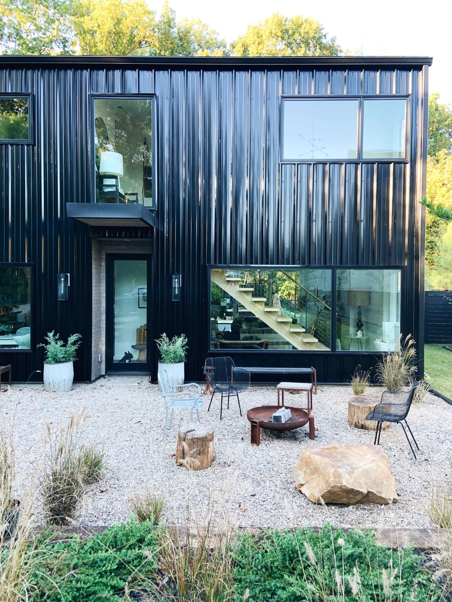
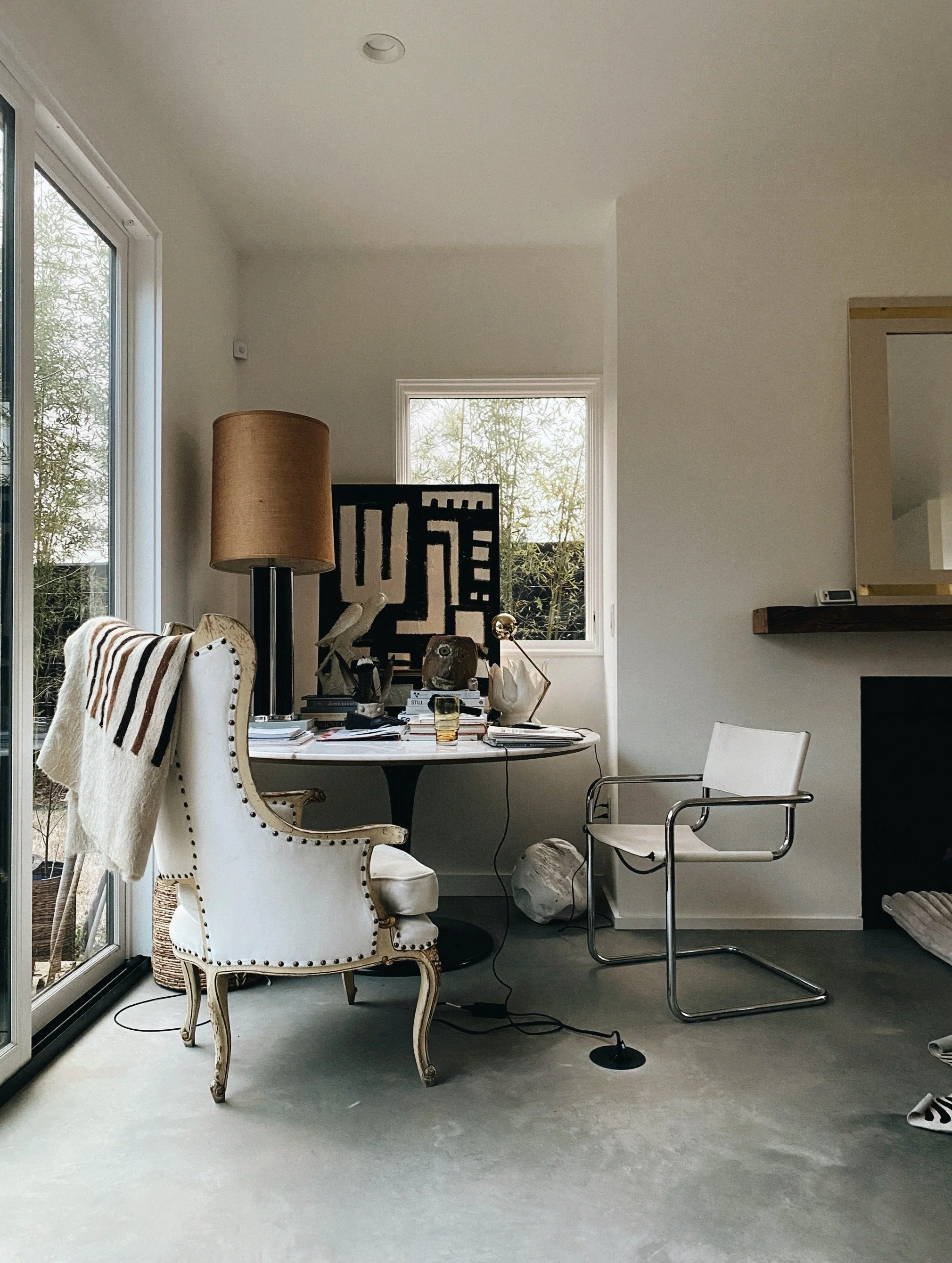
And if you’ve been following me for a while, you already know this. I may be overstating the obvious, considering I live in a black house, my second one, with white interior walls and black kitchen cabinets. I mean, this love affair runs deep.
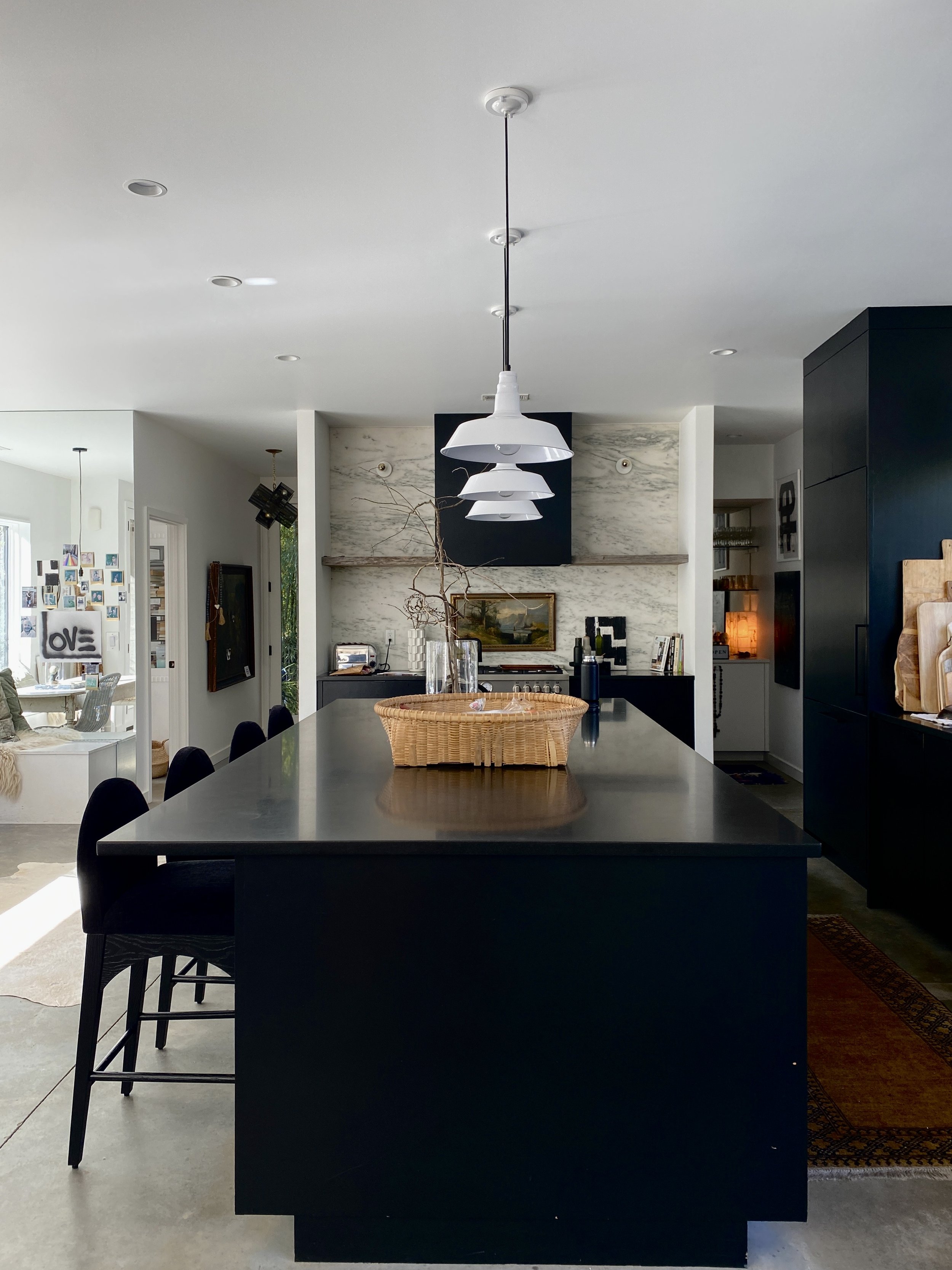
Black and white has always been a visual anchor in my work. Even in seasons when I leaned into saturated color, especially in my interior design work, I used black and white to ground a space. It offered structure, contrast and a place for the eye to rest. It helped everything else make sense.
The Power of Contrast in Color Theory
If you're familiar with color theory, you might know that black absorbs all wavelengths while white reflects them. Together, they hold the full spectrum without saying a word. That kind of balance, that subtle tension, has always pulled me in. There’s something about it that feels both timeless and modern. Bold and calm. Minimal and emotional. It creates space for interpretation, for stillness, for something unspoken to emerge.
They say every space needs a touch of black. I’d say it needs the balance of both black and white. Black gives weight. White brings light. Together, they create rhythm and rest, contrast and clarity. In both interiors and artwork, I’ve found that their interaction doesn’t just make something look complete. It makes it balanced, in both mood and meaning.
Black and White as a Visual and Emotional Language
For me, black and white isn’t just a color palette. It’s a form of visual communication. An emotional language. A way of sensing and sorting what matters. It strips things down to the essence and lets me listen more closely to what wants to come through. It’s where I begin. And often, where I end.
My Long Relationship with Color
Color and I have a long relationship… we go way back. One that’s shifted over time as I’ve changed.
I still love color. I always have. In a previous season, I used lots of bold, saturated hues. These days, I’m more drawn to deep greens, muted blues, neutrals and earthy tones that feel grounded and calming. You’ll still find color in my home, in my closet and throughout my abstract work. Lately, even a touch of Vermillion has caught my eye. Just enough to shift the temperature.
I think it’s important to leave room for those changes. To allow the evolution. To follow what calls to you creatively. But even when I explore color, contrast continues to guide me. It sharpens my eye. It deepens the mood. It makes the work feel like mine.
Returning to the Space Between Light and Shadow
Maybe it’s the space between light and shadow that I’m most drawn to. The edge. The energy. The in-between. That liminal place where things aren’t fully defined, but they’re fully felt. Black and white shows up again and again in my work. It’s a thread that continues to pull me back to a grounded center.
It’s more than a trend. Beyond an aesthetic. It’s a way of seeing. A rhythm. A relationship. And after all these years, I’m still in love with black and white. And I still feel like I’m learning how to speak it.
Are You Drawn to Black and White Too?
Do you return to the same colors again and again, no matter how your style shifts? What speaks to your eyes, your body, your inner sense of harmony?
xx,
Michel